The Learning Series – Ordinary to Extraordinary
Welcome to the Learning Series! This post is the first in a series examining composition, elements of design, and the principles of organization that can turn ordinary photographs into extraordinary photographs. There are a lot of techniques to consider, learn and practice but increasing your knowledge of these ideas and techniques and practicing them will improve the way you see the world around you and they’re essential to helping you develop your own creative style.
What makes an extraordinary image?
What are the factors that transform an ordinary image into an extraordinary one? I think the most extraordinary images create order out of chaos; they are simple in their composition yet strong in statement, they are asymmetric compositions with just enough structure to convey an idea or a feeling, and they have good eye lines drawing the viewer into and around the composition. But what does all that mean? And how does a photographer accomplish that? Improving the quality and composition of your photographs means following in the footsteps of the brilliant photographers and artists who came before you. Learning from and practicing those techniques allows you to compose your photographs purposefully and artfully. For an extraordinary image, it isn’t enough to point your camera at a scene and press the shutter. It’s a chaotic world out there and as a photographer, your job is to create order from the chaos with a purposeful composition.
What is composition?
But first, what do we mean by composition?
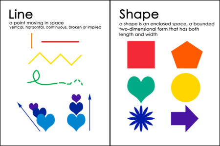
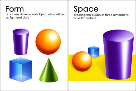
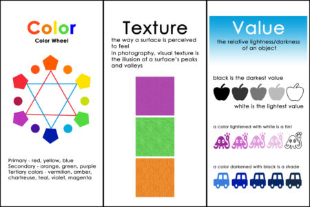
In all visual arts, including photography, composition is how the visual elements of the artwork are arranged. It implies that these elements are placed thoughtfully, using the elements of design. The visual elements of design are:
Extraordinary photographs incorporate one or more of these elements. These elements relate to each other and they work together to create the whole of a photograph. Knowing these elements of design and how to use them will help you compose more artistic photographs, photographs that go beyond the snapshot and into the realm of artistry and extraordinary.
Principles of Organization
It’s not enough to just know the elements of design. A photographer needs to know how to use them. Using the elements of design is guided by the principles of organization. So while Color is an element of design, using color in your composition to guide a viewer’s eye or evoke a certain emotion is employing the principles of organization. The principles of organization are where we really get to the heart of the composition. As a photographer, YOU decide what the focal point of your image is going to be and how you will use the elements of design to direct your viewer to the focal point.
One quick note about this; most of the time, it is the environment that helps you decide how to use the elements of design. It will take some practice to learn to see and how to use them. It might be a red ball that catches your eye, or the sun glinting off a railing that recedes into the distance. The elements of design will already be there, they aren’t packed in your camera bag, ready to pull out at the perfect moment to create the perfect scene. Staging a scene is a possibility though, so don’t rule it out!
There are many principles of organization, such as:
- Arrangement
- Balance
- Color
- Contrast
- Emphasis
- Harmony/Unity
- Illumination
- Lines
- Movement
- Perspective
- Rhythm/Repetition/Pattern
- Shape/Proportion
In this post, the focus is on Arrangement, and more specifically, the Rule of Thirds.
The Rule of Thirds
First up – Rule of Thirds! Why? Because it is one of the easiest ways to improve the quality of your photos RIGHT NOW! And, there’s more to it than you think. As a photographer at any level, I’m sure you’ve heard of the Rule of Thirds. It is probably the most commonly talked about, referred to and discussed compositional element in photography, especially beginner photography. The Rule of Thirds is more of a rule of thumb, though. It is just as important to know the rule and how to use it as it is to know when to break the rule.
Simply, the rule of thirds suggests that compositional elements should be placed off center. It means NOT placing your subject in the middle of the photograph and instead, placing key elements of your composition on the intersection points of a tic-tac-toe-like grid.
The grid is made up of 9 sections; the top 3, the middle 3 and the bottom 3 sections. Likewise, there is the left 3, middle 3 and right 3 sections. Ideally, you would place important elements of your photograph near the intersection points because it is visually pleasing, creates more interest and invites the viewer to look at more of the image.
In the sample image above, you can see that the horizon is placed in the bottom 3rd of the grid, and the person on the lifeguard tower is placed near the right third of the frame. The focal point of the image is the lifeguard tower and the people around it, and all of those elements are placed in sections of the grid that give them visual importance. Their placement commands attention and directs your eye away from the center of the frame, creating a more dynamic composition.
In this sample image, the lifeguard tower is about in the middle of the frame. The horizon line is below the bottom 3rd intersection and the sun is in the bottom right section. This image isn’t as visually pleasing as the one above, even though the subject and focal point of the image is the same as the previous one. Why? Because the lifeguard tower divides the frame in half, it is somewhat confrontational and dominating and it wants to keep your eye there. It is less inviting to look around.
If we change our grid lines to show only 4 quadrants, the weight of the lifeguard stand in the center is more obvious.
Horizon Lines – Which Third?
Placing your horizon line in the center has the same effect as placing your subject in the middle of the frame; it divides the photo in half. Your composition will appear undefined and uncertain. But how do you determine whether the horizon line should be in the top third or the bottom third?
It depends! Which is more interesting, the sky or the foreground? If the sky is more interesting, place the horizon line in the bottom third. If the foreground is more interesting, place the horizon line in the top third. In the case of my sample image, the sky isn’t more interesting, but the lifeguard tower is. If I had placed the horizon line in the top 3rd, most of the lifeguard tower would be cut off. Take a look at the following series of images to see how using the Rule of Thirds in placing your horizon line shows your viewer what the main subject or important elements are:
- Death Valley Hwy – The obvious subject here is the road, so it makes sense to place the horizon in the top third.
- Ubehebe Crater – the horizon is the rim of the crater; the subject is the rim and side of the crater so the horizon is placed in the top third.
- Lavender – the horizon is where the lavender rows meet the Abbey; I wanted to highlight the lavender so the horizon is in the top third.
- Lavender Farmer – the farmer is the subject, this is an environmental portrait so the lavender illustrates the subject’s life, so again, the horizon is placed in the top third.
- Oregon Sky – the subject is the sky and the cloud, so the horizon (top of the grass) is in the bottom third.
- River Seine – the subject is the river, so the horizon is in the top third
Sometimes, your horizon is not where land meets sky, as in the Ubehebe Crater and Lavender images above. Survey your scene and identify potential horizons, then compose your image with the horizon that makes the most creative sense for your image.
The Left Third or the Right Third?
Did you know that people generally have a preference for subjects in the right third? Because we have a natural tendency to read left to right, enter a space and scan from left to right, it makes sense to place your subject in the right third of the frame. When our eyes enter the frame of a photograph, we generally start at the left and scan to the right, searching for the main subject and a comfortable landing place, which most of us prefer on the right side.
Aside from the numbers on the lifeguard stand being backward, the sample image in reverse is less comfortable.
Here’s another example; the first image is the original. The scene is representative of reality.
Here’s the same image, but flipped horizontally so that the subject is on the left.
Right vs. Left is not a firm rule. Sometimes, the subject should be, needs to be on the left. But try this with your own photos; flip them. Either way, it will bother you because YOU KNOW which way is correct and it tickles your brain to see it backward. In this case, I’m pretty sure I like the subject on the right better than the left. It has more to do with scanning (as mentioned above) and the leading line of the snow-covered rail. It’s just more comfortable to scan the image from left to right than vice versa.
What if My Subject Has Direction?
If your subject has direction, that direction dictates right/left or top/bottom first. If your subject is in motion, the subject should then be placed so there is room in the frame for forward motion.
In the example above, the car’s forward motion was to the left, so I placed the car and the road in the bottom right 3rd of my frame. This placement allowed plenty of room for the car’s forward motion and allowed the interesting landscape to fill the top 2/3rds of the frame.
If your subject isn’t moving but is pointed or looking in a direction, the same technique applies.
This is the original image; the bird was facing right so I placed it in the left third of the frame. If I crop this image to place the bird in the right 3rd of the frame, the image loses the negative space for the bird to face/look into and it gets edgy and a bit uncomfortable.
The Rule of Thirds is a great tool when you’re starting out. It forces you to slow down (a good thing), consider the scene (a very good thing) and thoughtfully compose your photograph (the very best thing). It is ONE tool in a huge bag of tools to help you thoughtfully compose your photographs. But like all rules, it’s made to be broken!
Breaking the Rules
Not every subject benefits from the Rule of Thirds, so learning the rule, applying it and thoughtfully composing photographs will help you to quickly learn that there are definitely times to ignore this rule. Let’s look at some examples!
- A lone tree against the sky – the most important feature of this image is the tree. It should be dominant in the frame. Centering works well here.
- Reflections – a center horizon, and in this case a centered subject are typical elements of reflection photos in which the reflection is like a mirror.
- Boat on a Lake – the boat is in and leaving the frame in the same third. In this image, it works because the wake of the boat is a strong element of the photo.
- Car on a Bridge – the headlights are in the center bottom third, but the bridge is dominating the image. This is also a vanishing perspective image, so the bridge forms the leading lines of the headlights.
The Rule of Thirds is an important and essential photography composition technique. You can apply it to almost any subject to improve the composition and arrangement of your images. Learn to use the rule effectively. Then play with it; bend it, twist and break it! When you know how to use the Rule of Thirds, you’ll know when to effectively break it too.

